Course support material overview
Here you find supporting material for the IMSCIA
C21 – Data Visualization course.
You will find the course bibliography, some more general reading material and pointers to
software for testing.
Then there are the lecture specific materials:
L01 – Visualization fundamentals
L02 – Prepare and know your data
L03 – Visualization flavors
L04 – Scientific visualization
L05 – Information visualization 1
L06 – Information visualization 2
L07 – Non conventional techniques
L08 – See and act
L09 – Visual communication
L10 – Choice and evaluation
Same of the links are credits to the source of images or information; other interesting additional data ad references.
Please report any broken link or new references you think are worthwhile.
Now you can return to the C21 course page.
Course bibliography
- Information Visualization: Perception for Design, 2nd edition, Colin Ware, Morgan Kaufman (2004)
- Visual Explanations – Images and Quantities, Evidence and Narrative, 3rd edition, Edward R. Tufte, Graphics Press (February 1997)
- The Visual Display of Quantitative Information, 2nd edition, Edward R. Tufte, Graphics Press (May 2001)
- Envisioning Information, Edward R. Tufte, Graphics Press (May 1990)
- 14 Ways to Say Nothing with Scientific Visualization,
A. Globus, E. Raible, IEEE Computer, Vol. 27, No. 7, pp. 86-88; July 1994.
- The Visualization Toolkit – An Object-Oriented Approach To 3D Graphics by Will Schroeder, Ken Martin, Bill Lorensen, 3rd Edition
2003 Kitware, Inc.
- Scientific Visualization: Advances and Challenges,
L. Rosenblum, R.A. Earnshaw, J. Encarnacao, H. Hagen, A. Kaufman, S. Klimenko, G. Nielson, F. Post, D. Thalmann (eds), 1994 Academic Press.
Part II, IV (especially chapters 15 and 18), VI (only chapters 23 and 26).
- Scientific Visualization, G. Nielson, H. Hagen, H. Müller (eds), 1997 IEEE Computer Society Press.
Chapters: 1, 2, 7, 8, 9, 10
Other reading material
- Information Visualization, Robert Spence, Addison-Wesley (2001)
- Visual cues: practical data visualization, Peter R. Keller, Mary M. Keller – Los Alamitos, CA IEEE Computer Society Press [etc.] cop. 1993
A little old, but has some really interesting ideas on visualization selection.
- Readings in information visualization : using vision to think, Stuart K. Card, Jock D. Mackinlay, Ben Shneiderman
San Francisco, Calif. – 1999 Morgan Kaufmann Publishers
It is a compilation of papers on Information Visualization.
- Curriculum for Visualization (SIGGRAPH Education Committee).
Software for testing
Free
- XGobi
- Information visualization.
- GGobi
- A more recent version of XGobi.
- XmdvTool
- Information visualization tool.
- VTK
- Visualization toolkit.
- ParaView
- Scientific visualization tool for end user.
- Gnuplot
- Plotting package.
Commercial
- Matlab
- End User tool plus some visualization component.
- AVS/Express
- Visualization development system geared toward scientific visualization.
- Spotfire
- Information visualization end user tool.
L1 – Visualization fundamentals
PA – Visualization definition and goals
[status: recorded, slides: 31]
- Richard Hamming.
- Visualization in Scientific Computing, B. McCormick, T. DeFanti, and M. Brown eds., ACM Siggraph Computer Graphic, vol. 21, no. 6, Nov. 1987, p. 3
- John Snow cited by Tufte in Visual Explanations.
- Tufte, Visual Explanations for Playfair and Michael Florent.
-
Kekulè dream.
- The history of “a picture’s worth…”
- Why Visualize? We think this Quicktime animation (2.6 MB) about
visualizing plaque on an artery wall tells the story quite well. It shows the stages in going from the original 2D ultrasound scans to a
full color 3D representation of the artery – which is much easier to interpret and understand.
This visualization was created by Colin Currie, Dept. of Medicine, University of Sydney.
Other material
PB – Visualization reference model
[status: recorded, slides: 18]
- Reference model: Systematic Approaches to Visualization:
Is a Reference Model Needed? P. Robertson and L. De Ferrari, in Scientific Visualization, 1994, Advances and Challenges,
Ed: L. Rosenblum, R.A. Earnshaw, J. Encarnacao, H. Hagen, A. Kaufman, S. Klimenko, G. Nielson, F. Post, D. Thalmann , Academic Press.
- Visualization Pipeline: Visualization Idioms: A Conceptual Model for Scientific Visualization Systems,
R.B. Haber, and D. A. McNabb, in Visualization in Scientific Computing, G. M. Nielson, B. Shriver and L.J. Rosenblum (eds), IEEE Computer Society Press.
- What Is VTK?
- AVS/Express introduction.
PC – Human visual perception issues
[status: recorded, slides: 36]
L2 – Prepare and know your data
PA – Logical data types
[status: recorded, slides: 26]
PB – Physical data formats
[status: recorded, slides: 16]
PC – Scientific data management
[status: recorded, slides: 15]
- NEESgrid data repository project.
Contains interesting references to metadata harvesting and general information on the data management problems
in scientific research.
- “Designing Metadata for the NEESgrid Data repository”. April 2003
[PPT]
This presentation contains an introduction to metadata and the comparison of old (one shot) and new (reuse) research methods.
- Ensembl Genome Browser.
- Protein Data Bank.
Other material
PD – Operative suggestions
[status: recorded, slides: 11]
L3 – Visualization flavors
PA – Application fields subdivision
[status: recorded, slides: 13]
- Does the differences between Information and Scientific Visualization Really Matter?
IEEE Computer Graphic and Applications vol. 23, no. 3 May/June 2003.
PB – Traditional techniques
[status: recorded, slides: 37]
Other material
PC – Other traditional techniques
[status: recorded, slides: 14]
L4 – Scientific visualization
PA – Introduction to scientific visualization
[status: recorded, slides: 7]
PB – Color for scalar data visualization
[status: recorded, slides: 35]
PC – Scalar data visualization
[status: recorded, slides: 16]
PD – Vector and tensor visualization
[status: recorded, slides: 17]
PE – Spatial visual cues
[status: recorded, slides: 16]
Other material
L5 – Information visualization 1
PA – Introduction to information visualization
[status: recorded, slides: 9]
Other material
PB – Multidimensional techniques
[status: recorded, slides: 11]
PC – Geometric techniques
[status: recorded, slides: 9]
PD – Icon and pixel based techniques
[status: recorded, slides: 12]
PE – Navigation strategies
[status: recorded, slides: 10]
PF – Dynamic techniques
[status: recorded, slides: 8]
L6 – Information visualization 2
PA – Trees and hierarchies
[status: recorded, slides: 25]
PB – Graphs and networks
[status: recorded, slides: 15]
L7 – Non conventional techniques
PA – Change your frame of mind
[status: recorded, slides: 26]
- Nine Dots Game.
- In the 1960’s the Scientific Subroutine Library on IBM mainframe computers included a random number generator named RND or RANDU. It was a
multiplicative congruential with parameters a = 65539, c = 0, and m = 231. With a 32-bit integer word size, arithmetic mod 231 can be done quickly.
Furthermore, because a = 216 + 3, the multiplication by a can be done with a shift and an addition. Such considerations were important on the
computers of that era, but they gave the resulting sequence a very undesirable property: there is an extremely high
correlation among three successive random integers of the sequence generated by RANDU.
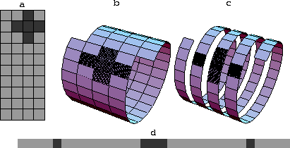
- Convolution in 1-D does convolution in 2-D. Deconvolution in 1-D does deconvolution in 2-D. The
“Helix” paper.
- Diagram to 3D geons.
- Ulam Spiral. This construction was first made by Polish-American mathematician Stanislaw
Ulam (1909-1986) in 1963 while doodling during a boring talk at a scientific meeting. While drawing a grid of lines, he decided to number the
intersections according to a spiral pattern, and then began circling the numbers in the spiral that were primes. Surprisingly, the circled primes
appeared to fall along a number of diagonal straight lines or, in Ulam’s slightly more formal prose, it “appears to exhibit a strongly nonrandom
appearance” (Stein et al. 1964). The spiral appeared on the March 1964 cover of Scientific American magazine.
- Carlis, J., Konstan, J., “Interactive visualization of serial periodic data”, Proc. ACM UIST '98, 29-38.
-
Mastering Interactive Virtual Bronchioscopy on a Low-End PC,
by Rainer Wegenkittl, Anna Vilanova, Balint Hegedüs, Daniel Wagner, Martin C. Freund, and Eduard Gröller.
Published in IEEE Visualization 2000, Conference Proceedings, pages 461-464, October 2000.
- GeneVis: info & sci viz techniques.
- Cartography applied to non cartographic info.
- Global Visualization and Alignments of Whole Bacterial Genomes, Pak Chung Wong, Kwong Kwok Wong, Harlan Foote, and Jim Thomas.
IEEE Transactions on Visualization and Computer Graphics, Vol. 9, No. 3, Jul-Sep 2003.
- VideoCube paper and
application.
Other material
- This picture explains the relation between 1-D and 2-D
filtering. To filter, you screw the filter onto the data. Convolution in 1-D does convolution in 2-D. Deconvolution in 1-D does deconvolution
in 2-D. Likewise for spectral factorization, etc. Makes a great preconditioner for inversion. Rapidly solves [1+Dxx+Dyy]u=v.
The entire “Helix” paper (16 pages of .ps) or
html.
- SOM-Based Data Visualization Methods.
Juha Vesanto (1999). In Intelligent Data Analysis, Volume 3, Number 2, Elsevier Science,
pp. 111-126. © 1999 IOS Press. By permission.
PB – Visualization for assimilation
[status: recorded, slides: 14]
Other material
PC – Graphical visual thinking techniques
[status: recorded, slides: 23]
Other material
- Creating
Creativity for Everyone: User Interfaces for Supporting Innovation, Ben Shneiderman (February 1999).
A challenge for human-computer interaction researchers and user interface designers is to construct information technologies that support
creativity. This ambitious goal can be attained by building on an adequate understanding of creative processes. This paper offers the four-phase
genex framework for generating excellence: – Collect: learn from previous works stored in digital libraries – Relate: consult with peers and mentors
at early, middle and late stages – Create: explore, compose, and evaluate possible solutions – Donate: disseminate the results and contribute to the
digital libraries Within this integrated framework, this paper proposes eight activities that require human-computer interaction research and
advanced user interface design. A scenario about an architect illustrates the process of creative work within a genex environment.
- Models for the Creative Process
by Paul E. Plsek (1996).
L8 – See and act
PA – Interaction methods
[status: recorded, slides: 28]
- Investigating the effect of texture orientation on shape perception
Victoria Interrante – Department of Computer Science and Engineering – University of Minnesota.
- Power of Ten explanation and
interactive applet. View the Milky Way at 10 million
light years from the Earth. Then move through space towards the Earth in successive orders of magnitude until you reach a tall oak tree
just outside the buildings of the National High Magnetic Field Laboratory in Tallahassee, Florida. After that, begin to move from the actual
size of a leaf into a microscopic world that reveals leaf cell walls, the cell nucleus, chromatin, DNA and finally, into the subatomic
universe of electrons and protons.
- Collaborative AVS. An example of collaborative visualization environment.
- Multidimensional Grand Tour methods. Especially interesting the
original one (compressed Postscript).
- Risk of dequantification: the Venus Globe animation.
Other material
PB – Direct manipulation methods
[status: recorded, slides: 17]
PC – Operative visualizations
[status: recorded, slides: 21]
PD – User-in-the-loop
[status: recorded, slides: 18]
L9 – Visual communication
PA – Visualize to communicate
[status: recorded, slides: 17]
Other material
PB – Having something to say
[status: recorded, slides: 14]
PC – Be clear
[status: recorded, slides: 27]
- Wayne Lytle — The Danger of Glitziness and Other Visualization Faux Pas – SIGGRAPH 1993.
- Mapping Votes by County.
County maps and the 2003 California Statewide Special Election by Jonathan Corum.
PD – Don’t lie
[status: recorded, slides: 23]
- Misleading Visualizations by Henrik Ingo.
“The Post-Enron world with its tough requirements on reliable financial reports has left US accountants and CEOs without choice.
They will now have to tell us the truth and nothing but the truth about their companies financial status. Or do they?”
A story about pictures that lie…
- THE ANCIENT CHINESE ART OF CHI-TING. Jim Blinn explain why
computer graphic must cheat (chi-ting) sometimes.
- How to display data badly, Howard Wainer, The American Statistician 1983.
Especially interesting is the online Wainer lesson.
PE – Know the medium
[status: recorded, slides: 22]
L10 – Choice and evaluation
PA – Choose a visualization
[status: recorded, slides: 22]
PB – Visualization evaluation
[status: recorded, slides: 28]
Other material
PC – Future
[status: recorded, slides: 15]
Other material
- Self-organizing maps (SOMs) are a data visualization technique invented by
Professor Teuvo Kohonen which reduces the dimensions of data through the use of self-organizing neural networks.